
This post originally appeared on Things for Boys. Abby is so sweet & offered to share this great advice with Daft readers, too!
I love that there are so many indie pattern designers around these
days. Modern day makers are really spoiled for choice! You can find
patterns and tutorials to suit any taste to make almost anything you
want.
A lot of bloggers who like to sew are turning to designing patterns
as a way to explore their creativity and earn a little income from what
they love to do. It’s always great to see an idea you have in your head
come to life! It’s even more exciting when you see other people making
them too!
I have one pattern for sale, The Big Tote Bag
and another pattern in the works. I
have used a lot of PDF patterns… some were great & equally, some were not so great. If
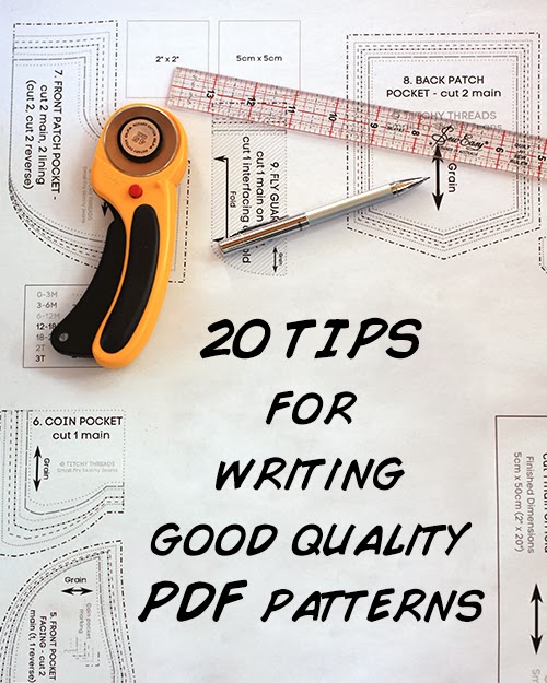
you’re thinking of writing a pattern, I wanted to share my tips & experience as both a designer & consumer for creating good quality PDF patterns that are easy to follow.
1. Use a plain, easy to read font. Save the fancy fonts for your cover page. Also, use standard left alignment. Centered text alignment can be harder to read.
2. Group your steps into logical sections. This can be tricky, but the more prototypes of your pattern you make, the better idea you get. Try to group things like all the pieces that need top stitching together so that those using your pattern won't need to be changing threads so often.
3. Number each step. If anyone ever needs to email you with a
question, it’s much easier for them to say ‘I’m lost on Step 5 in
Section 2′ than ‘I’m trying to insert the placket and I don’t understand
the bit where you fold it through’. Numbering your pages also helps.
4. Clearly lay out each section. Keep it ordered neatly with
the steps next to their photos and leave a bit of white space between
each step. The white space makes it easier to read and is handy for
adding annotations.
5. If you’re using abbreviations, make sure you use the full term the first time & list them in a glossary. Just because you know that RST means ‘right sides together’, it doesn’t mean every one does.
6. Include hyperlinks to techniques. These can be helpful where you don’t want to explain a technique or you feel it should already be known by the user.
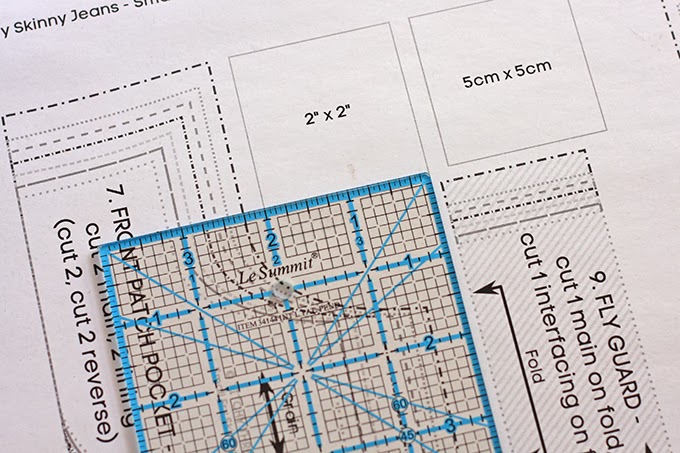
8. If your pattern includes printable pieces, make sure you include a printing test square. This square can be measured up so that the user knows the pattern has printed out the correct size. Many times I have printed out a pattern, stuck it together, cut out the paper pieces and then thought, I should check the test square, and guess what, it was wrong! Thankfully I hadn't cut into my fabric. A quick reprint, making sure no page scaling was set in the options and my pattern was perfect! If the test square wasn't there, I would have no idea if my pattern was wrong and would have wasted my time and fabric making something that was never going to fit.
9. Include full size pattern pieces. There is nothing more
annoying than printing out a pattern and then realizing the pieces need
to actually be printed at 200%. I don’t even know how to do that!
10. Make sure your pattern pages will print on both A4 and US Letter sized paper.
These papers are different sizes and there’s nothing worse than
printing it all out to notice that the sides (or tops) are chopped off
and your pages are useless. Also remember that you can’t print all the
way to the edge of a page. Keeping your pattern pieces within 19 x 25cm
(7.5″ x 10″) should ensure that your pattern pieces will print on most
printers.
11. Include grainlines and notches on your pattern pieces and a pattern layout diagram in your instructions! These are one of the things you find in the Big 4 patterns that are missing from a lot of PDF patterns - and they are so helpful!
13. Include a large format/copy shop version of your pattern. I’m so excited that designers are starting to include these with their patterns. For just a couple of dollars you can print out the pattern at the print shop…no aligning and sticking taping of pages needed! Also, this is more personal preference, but I don’t think it’s a good idea to overlap pattern pieces. The beauty of a PDF pattern is that you can just cut the pieces out of the paper and not bother with tracing. But when the pieces are overlapped (the lines of one pattern piece go over/intersect another, think Burda Style or Ottobre) then it needs to be printed out many times or traced off the PDF).
14. Use contrasting thread when stitching for the pattern photos. It makes your seams and stitches much easier to see in any photos. I have used white thread with blue fabric in this tutorial. Much easier on the eyes than a matching thread color.
15. Choose your fabrics carefully. On some fabrics the right
side and wrong side look the same, which can make your instructions
confusing. Try to pick a fabric with an obvious right and wrong side.
Patterns on fabric can also make photos and instructions confusing. Fine
stripes can be a real problem.
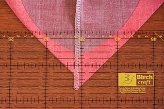
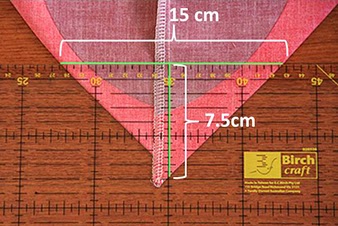
16. If you feel your photo may not be quite clear enough, feel free to add arrows, lines or notations to help get your point across. These can be done in fancy programs such as Adobe Illustrator or even just in MS Paint. You can see how much easier the image below is to understand with some measurements on it.
18. Test out your instructions by printing them in black and white. I also print mine out ‘2-to-a-page’ (at 50%) to make sure that they are still easy to understand when small. If they look good like this, then you know they will be easy to read if someone prints them out black and white (I only have a black and white printer at home) and also if viewing them at a reduced size on a mobile device.
19. Make your pattern cutting lines different. And not just a
different color, but patterned too. Making each line style different
makes each size easily distinguishable when printed in black and white,
not just colour. There’s a great example in the test square photo
above.
20. Get the pattern tested - more than once! I cannot stress this enough.
Your instructions make make complete sense to you, but could be very
hard for someone else to understand. If your pattern is simple enough
that you don’t think the pattern itself needs testing, at least have the
instructions proof read by someone who knows how to sew - as well as someone who doesn't, to make sure that they are clear enough for even a novice level sew-er to understand!
21. Bonus tip! If you’re want an in depth course showing you in great detail how
to create PDF patterns using Adobe Illustrator, then I can recommend
Lauren’s course over at Pattern Workshop. It’s very comprehensive and Lauren has a great teaching style.
connect with Abby
Do you frequently use PDF patterns? Have you got any tips to add? Anything that drives you nuts in PDF patterns? Let's chat about it in the comments!
No comments:
Post a Comment